![FF DIN Arabic Font Family [14-Weights]](https://www.gfxtra32.com/uploads/posts/2021-04/1619098826_23wqege.jpg "FF DIN Arabic Font Family [14-Weights]")
FF DIN Arabic Font Family [14-Weights]
14 TTF | Glyphs: 3170 | Supported Languages: Western Europe, Arabic | 2.94 MB
https://www.myfonts.com/fonts/urw/urw-din-arabic/
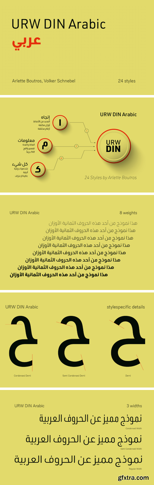
The digital outline fonts, DIN 1451 Fette Engschrift and Fette Mittelschrift were created by URW in 1984 and are the basis for all DIN font families. Both typefaces were designed for the URW SIGNUS system and were mainly used for the production of traffic signs. They have since become so popular that we have developed a complete Arabic DIN family together with Boutros Fonts. The Arabic characters have been designed to harmonize with our Latin URW DIN and come in 24 individual styles, which consist of 8 weights from Thin to Black and three different widths: Regular, Semi Condensed, and Condensed.
http://www.myfonts.com/fonts/linotype/din-next-arabic/
OTF | 7 Fonts | + JPG Preview


DIN 2014 Rounded Font Family
DIN 2014 Rounded is an extension of the industrial sans serif DIN 2014. It combines the softness and friendliness of the rounded endings with the seriousness and stability of the original typeface. Not a typical childish rounded font. DIN 2014 Rounded works well for medical or architectural topics, headings on the web or in periodicals, brand identity, packaging, and, thanks to the DIN proportions, for signage. DIN 2014 Rounded includes six styles ranging from extra light to extra bold, corresponding to the upright styles of DIN 2014, as well as a variable version. The typeface supports all European languages based on Latin, Cyrillic, and Asian Cyrillic (Tatar, Kazakh, Kyrgyz and other languages). Isabella Chaeva and Alexander Lubovenko worked on the rounded version. The typeface was released by Paratype in 2021.

https://www.myfonts.com/fonts/paratype/din-condensed/
Designed at ParaType (ParaGraph) in 1997 by Tagir Safayev. Based on a condensed style of DIN type family (Linotype Staff designers). That is a group of sans serif faces made to conform to the German Industrial Standard. Based on geometric style, they vary in width but not in weight. Light style was added in 2014 by Manvel Schmavonyan.
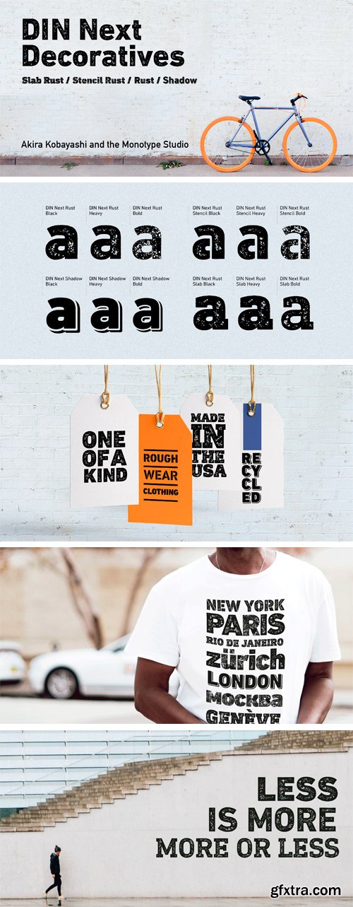
https://www.myfonts.com/fonts/mti/din-next-decorative/
This four-piece family is the DIN design, but not as you know it. The famously, crisp, clean and precise typeface has been given a textured update that’s reminiscent of rusted metal, or rubber stamps. Underneath this lies the same sturdy, geometric shapes that have allowed DIN to stand the test of time, but with a new sense of tangibility.
SermonBox - Seasonal Collection

SermonBox - The Series Pack Collection

Top Rated News


Would you like to be a Author?


